

dip! BODY PRODUCTS
ROLES
Art Direction
Layout
Packaging
Copywriting
Art Direction
Layout
Packaging
Copywriting
TOOLS
Photoshop
Illustrator
Figma
Photoshop
Illustrator
Figma
AT A GLANCE
The beauty and skincare industries have seen a shift in consumer demographics and brand positioning in recent years. A rise in gender inclusivity and self care in a cultural sense has helped to pave the way for more gender neutral products within the beauty industry.GOALS
Create a new line of body products that are genderless, affordable, and are committed to sustainability.


GENDER NORMS ARE BORING.
Women only buy pink razors and fragrances that smell of florals, right? And men ought to smell like wilderness and swagger? Mmm, no. These established views of strict gender roles have been enforced by marketing and packaging within the beauty industry. They are limiting and do not serve the needs of a wide range of consumers and identities.
How might one design a line of body products that seeks to break new ground visually, but most importantly, breaks outside of gender roles?
SOLUTION
A line of body products that is committed to sustainability and social awareness. Quality, transparent products are a priority for dip! as is cultivating confidence and self care within our customers.Products that are inviting and vibrant for younger generations are our priority — regardless of gender.
PROCESS
RESEARCH
During the beginning research phase we learned that imperfections, expression, and authenticity are all values that the Gen Z values as a demographic and influenced our initial framework driving dip!’s brand mission.
After poring over beauty articles, business consumer pieces, and a hefty PDF document on Gen Z consumer habits, we realized that it was imperative to remain authentic as a brand. Imperfections and expression are aspects that Gen Z values and we allowed for this to influence our initial brand framework.
The guiding framework of questions as we began to solve for this design challenge included:
- How can we showcase that we’re committed to leaving a positive legacy?
- How can we include our customer and show that we’re customer obsessed?
- In what ways can we interweave sustainable, cruelty free, and radically inclusive practices into our brand?
“The key to understanding Gen Z and their beauty needs is to accept their fluidity. They are self-educated, elusive and eco-conscious, and they actively seek out beauty brands that share these values.”
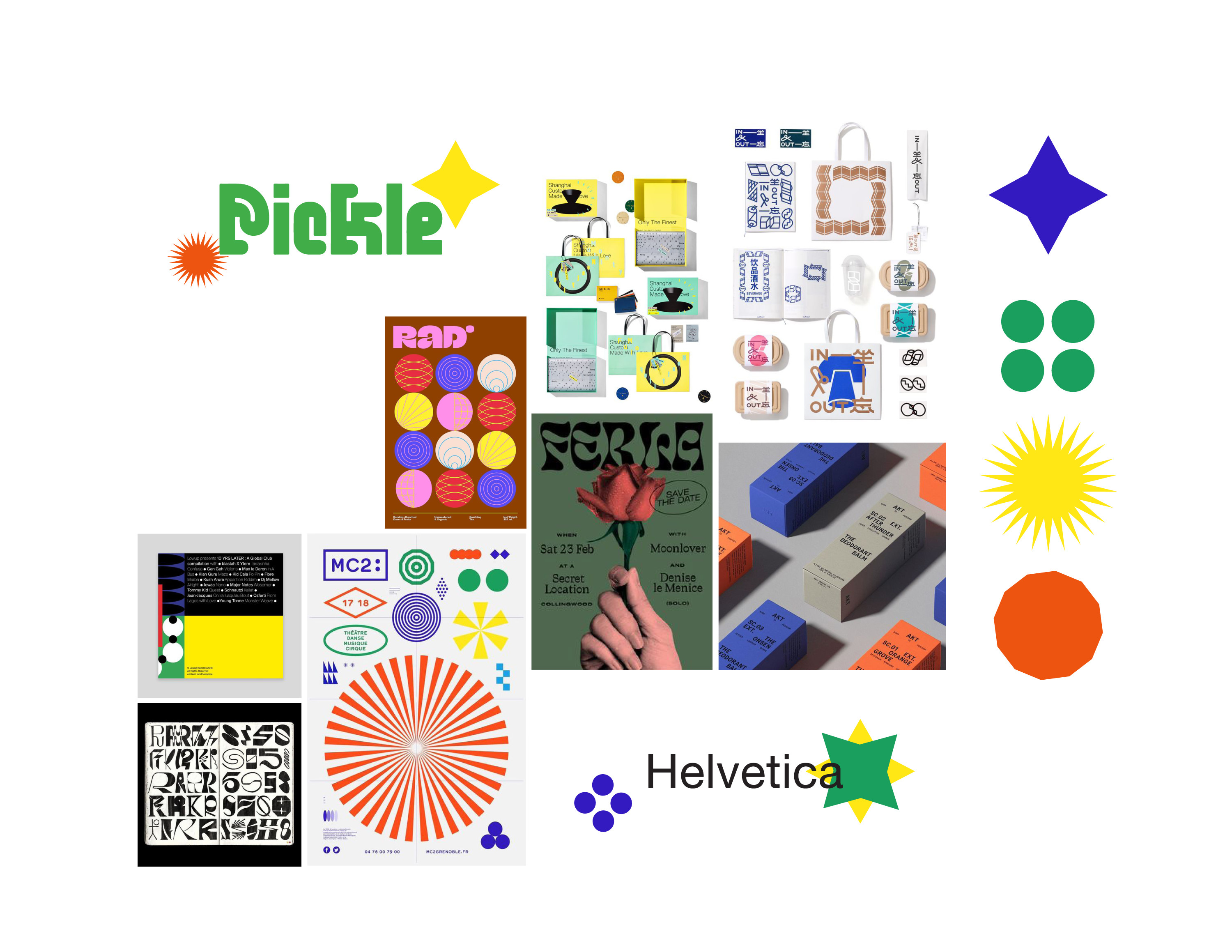
VISUAL INSPIRATION
After assessing other brands and their positioning within the body care industry, both Robert and I came to the conclusion that we wanted the brand to stand out visually. Muted, earth tone palettes are used by a majority of competitors and this prompted us to harness the energy found with a saturated palette and bold visuals. dip! is a brand for Gen Z so more youthful and energetic visual choices seemed appropriate, and would uniquely position them within the market.
The final visual board includes the inspired palette in addition to geometric symbols and more experimental typography.
BRANDMARK
The wordmark for dip! Is playful and irregular. The counters of the d and p reflect the tiddles of the i and ! respectively and their line width’s slight variations pays homage to the brand’s non-traditional nature. The idea behind the name came from a discussion about wanting to dip into something new and the name stuck.
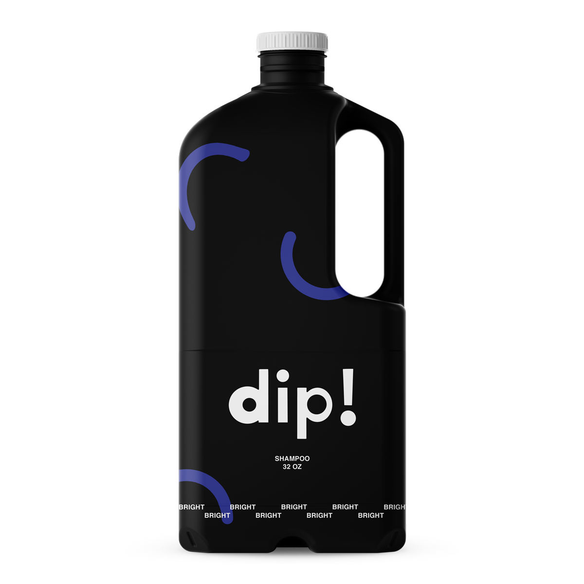
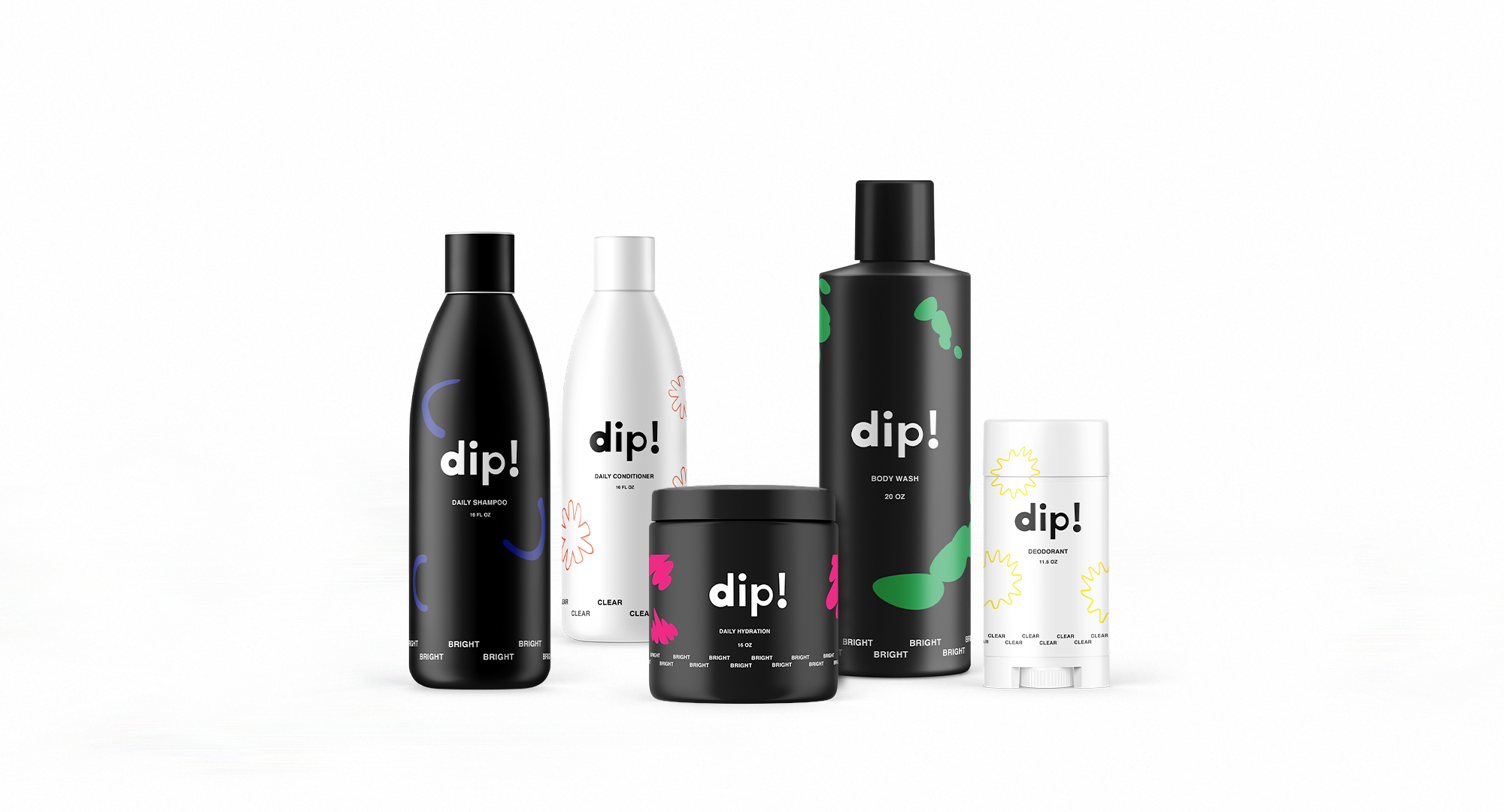
PACKAGING + DESIGN SYSTEM
dip! remains committed to sustainability through their packaging and distrubution. All of dip!’s packaging is made of recycled materials and never virgin plastics. Incentives are given to customers who recycle their dip! containers at select locations and to those who purchase product refills. Refills can be purchased online or at the traveling dip! pop-up shop.
The majority of ingredients are sourced from the US and products are filled and shipped from one main warehouse.
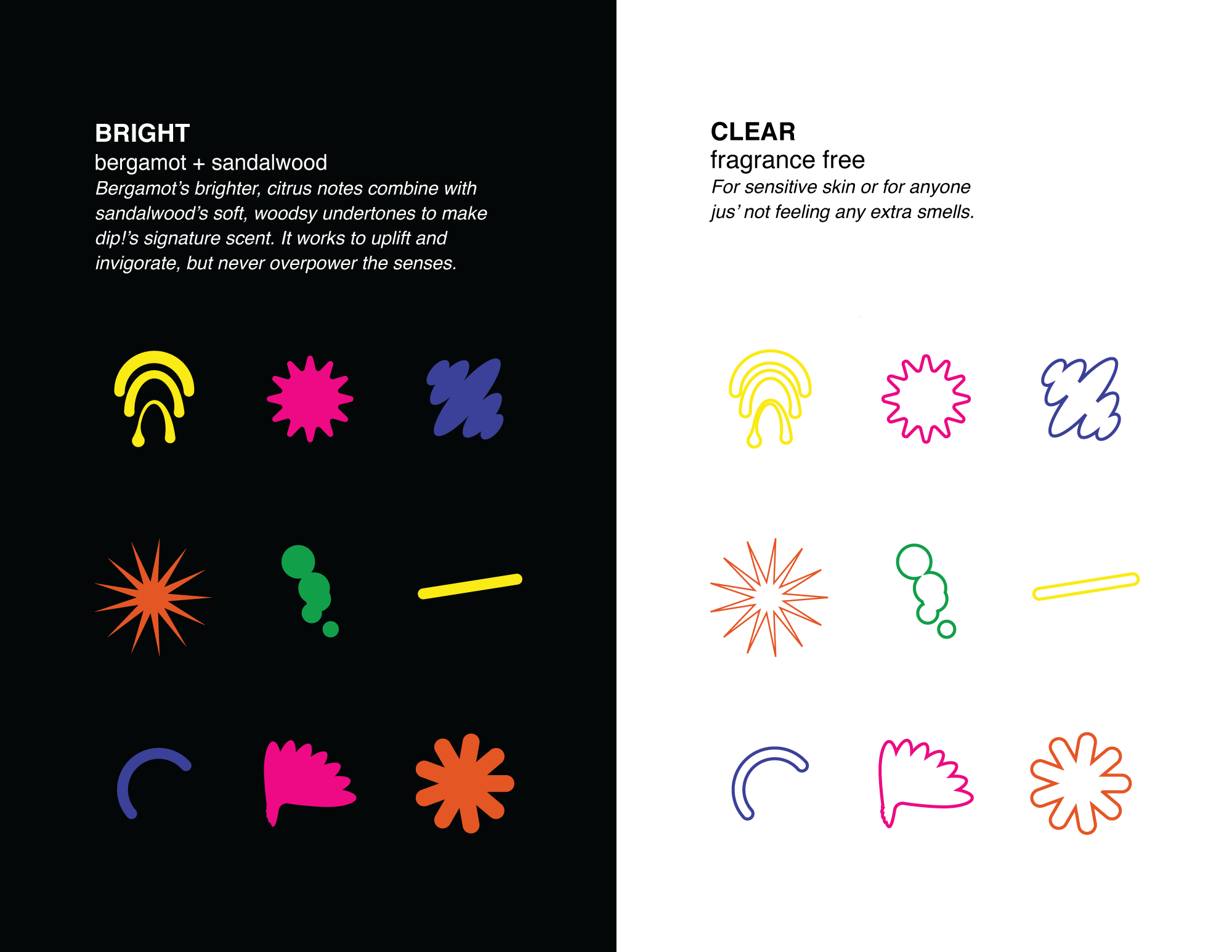
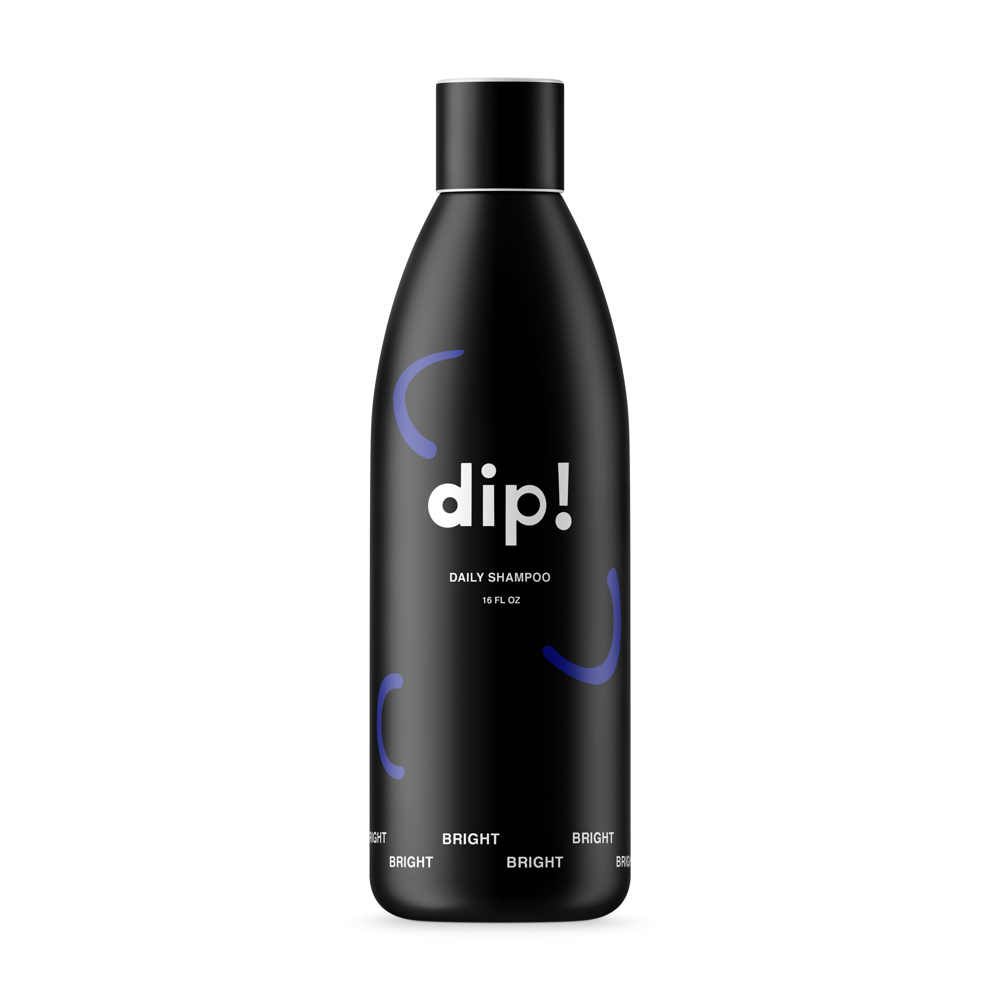
BRIGHT N’ CLEAR
dip!’s design system seeks to speak to the brand’s tone and energy and also plays a role in the visual communication on the product’s packaging. Each product of dip! comes in two fragrance options. Bright is dip!’s scented option which contains notes of bergamot and citrus. Clear is dip!’s fragrance free and sensitive skin option. The graphic components that have a solid fill color represent Bright while the solo elements that lack a fill represent Clear. They decorate each bottle accordingly.
dip!’s design system seeks to speak to the brand’s tone and energy and also plays a role in the visual communication on the product’s packaging. Each product of dip! comes in two fragrance options. Bright is dip!’s scented option which contains notes of bergamot and citrus. Clear is dip!’s fragrance free and sensitive skin option. The graphic components that have a solid fill color represent Bright while the solo elements that lack a fill represent Clear. They decorate each bottle accordingly.
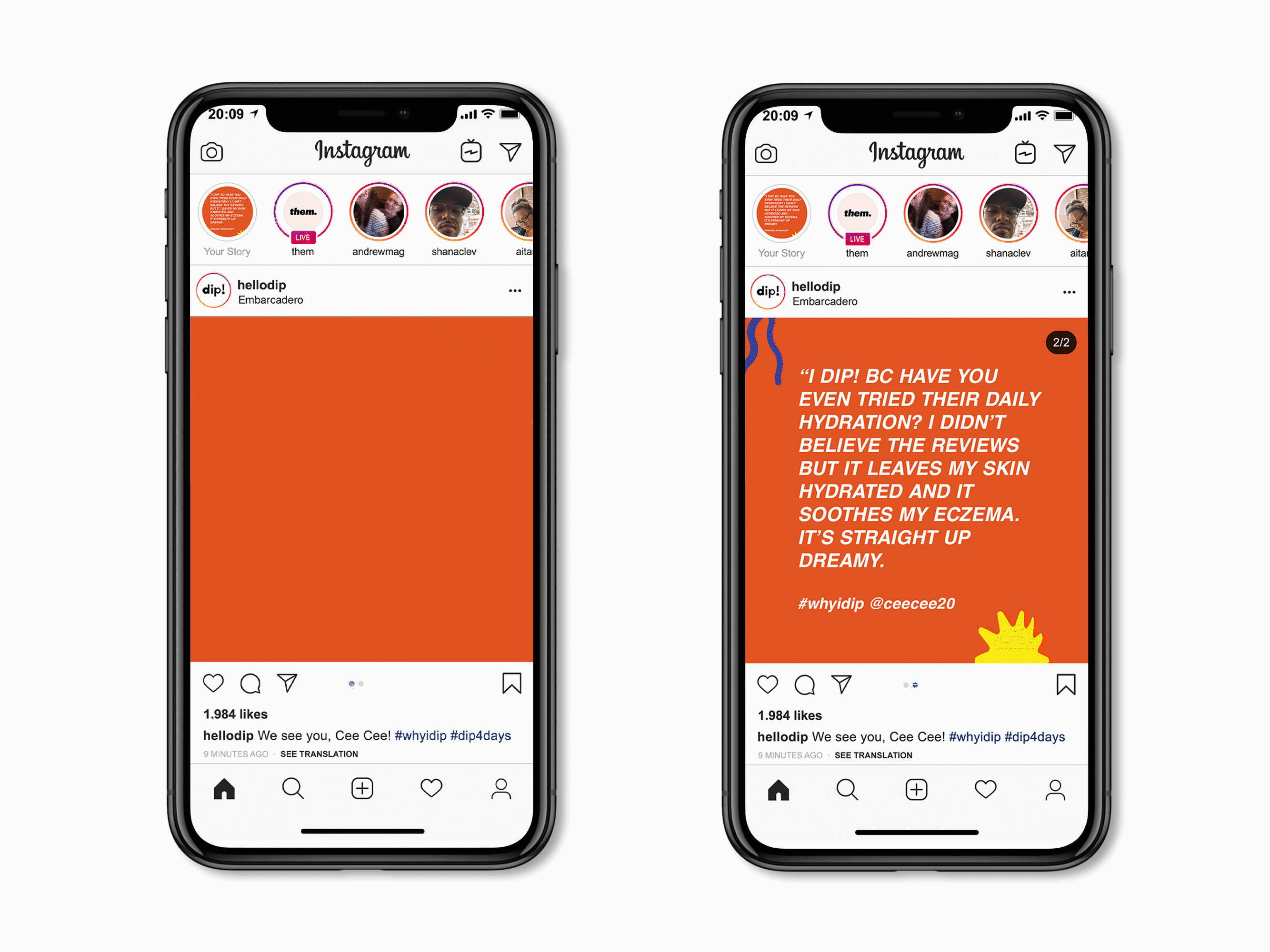
BRAND IN ACTION
PRODUCTS


WEBSITE
SOCIAL
![]()
PROJECT TAKEAWAYS
This was a project that provided Robert and I with several learning points. First, it allowed both Robert and I to pursue a target demographic that neither of us had much experience designing for nor marketing to. Second, because of this demographic, we both were able to pursue a new visual style that was outside of our familiarity.
With more time provided, it would be of great benefit and insight to receive more qualitative feedback from users within Gen Z. Iterating and tweaking the design system on dip!’s packaging would help to ensure accessibility and functionality.
With more time provided, it would be of great benefit and insight to receive more qualitative feedback from users within Gen Z. Iterating and tweaking the design system on dip!’s packaging would help to ensure accessibility and functionality.