

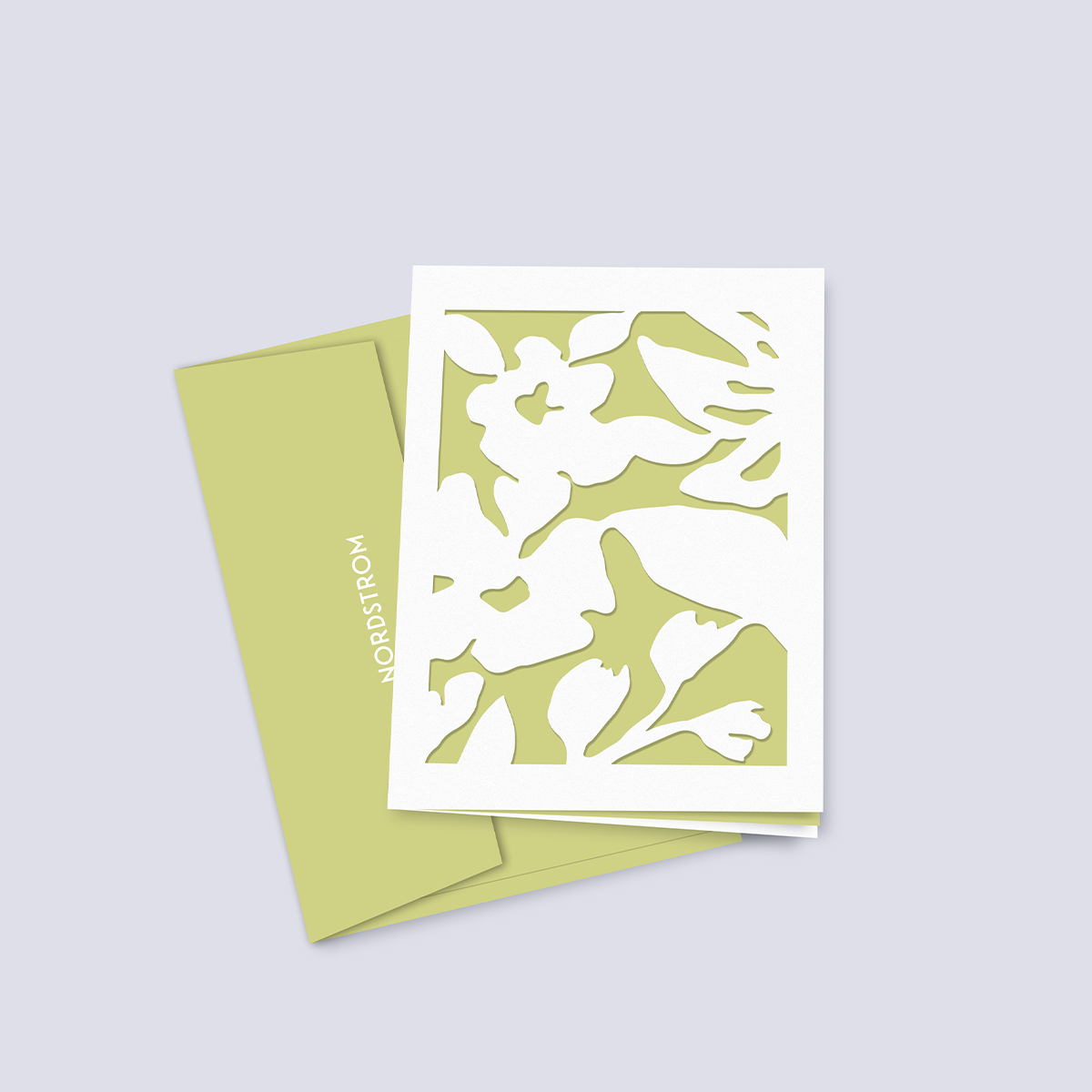
NORDSTROM
SPRING CAMPAIGN
TIMELINE
5 weeks
TEAM
Student Project
5 weeks
TEAM
Student Project
ROLES
Art Direction
Packaging
Layout
Art Direction
Packaging
Layout
TOOLS
InDesign
Illustrator
Laser Cutter
InDesign
Illustrator
Laser Cutter
AT A GLANCE
Nordstrom is a Seattle based retailer that has a 100+ year history of providing quality shopping experiences and services to its customers. They are a full-line retailer that has departments in footwear, men and women’s clothing, cosmetics, fragrances, handbags, and more. Design wise, customers typically take note of their wordmark and silver shopping bags. GOALS
- Conduct research about Nordstrom’s history, brand values, and customers
- Design a cohesive seasonal line of products that fit within the existing brand
- Create packaging that is environmentally sensitive, and uses biodegradable or compostable materials when possible

BUT IS IT... ON BRAND?
How does one integrate a campaign into an existing and iconic brand such as Nordstrom? Additionally, how might one design a campaign that has a varied customer demographic?SOLUTION
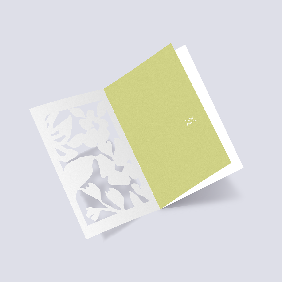
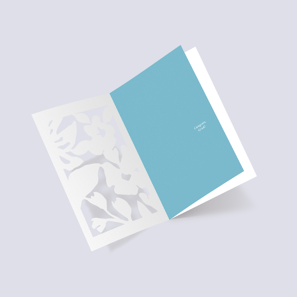
Beginning research led me to find that Nordstrom has a customer demographic that spans multiple generations. This laid the foundation for an inclusive spring campaign that aims to celebrate important holidays and events including Mother’s Day, graduation, and Earth Day. Paper cut packaging elements and floral motifs are utilized in order to reflect an intimate, yet refreshing approach for a varied audience. PROCESS
CUSTOMER FIRST
When first considering the Nordstrom customer, I began by doing some research and talking to Nordstrom employees. Nordstrom’s consumer market is female dominated and their customers include both full price and off price shoppers. While the majority of the customer demographic includes both Millennial and Gen X, they are constantly working to attract younger shoppers.
When first considering the Nordstrom customer, I began by doing some research and talking to Nordstrom employees. Nordstrom’s consumer market is female dominated and their customers include both full price and off price shoppers. While the majority of the customer demographic includes both Millennial and Gen X, they are constantly working to attract younger shoppers.
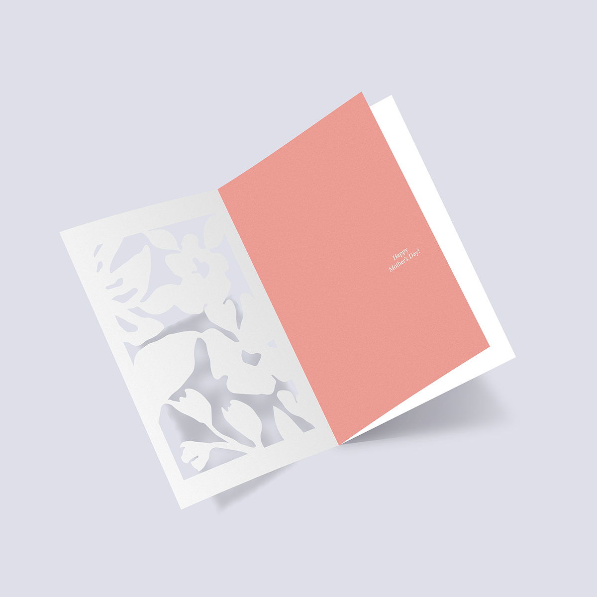
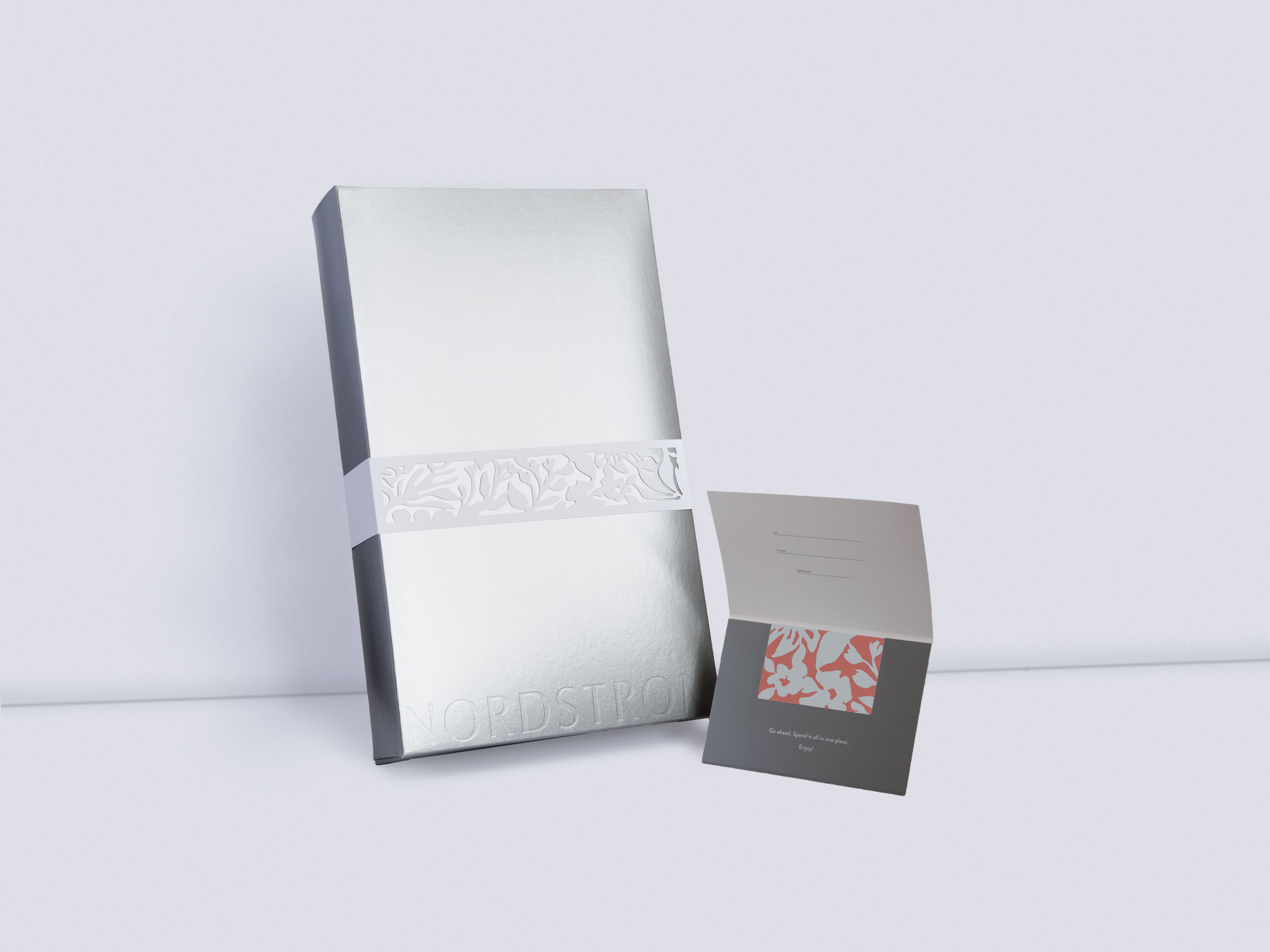
After this initial research and examining Nordstrom across different touchpoints, a proposal was written and a moodboard was created. Feedback was given and a fleshed out visual direction board was created for the product line. A gift box bellyband, gift card, and greeting card were chosen to carry out this seasonal campaign.
Jali patterns and paper cut outs had been the source inspiration for the visual direction. Its reductive process is a fun way to conceptualize a process and it also allows for potential re-use of a packaging product.
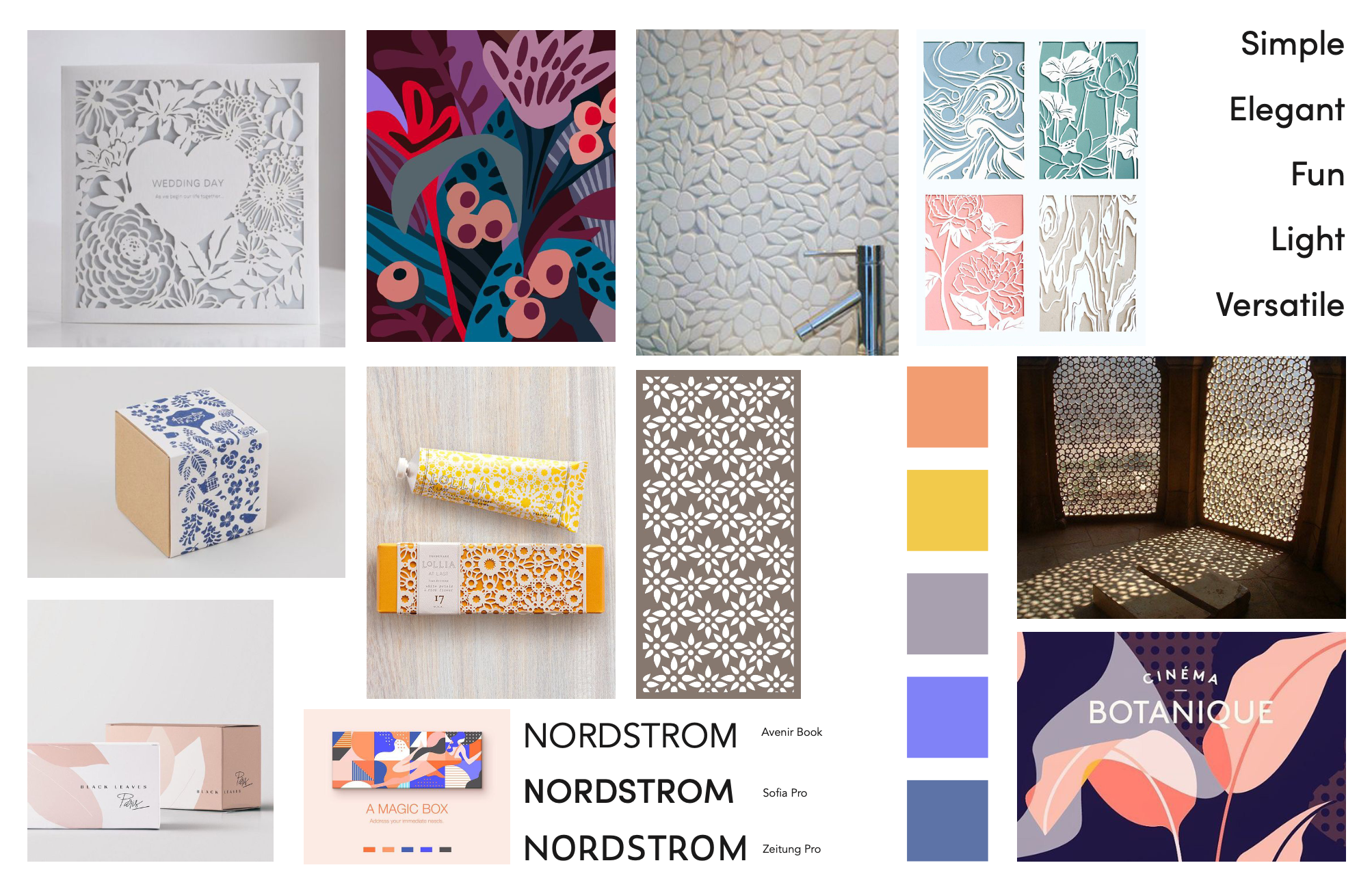

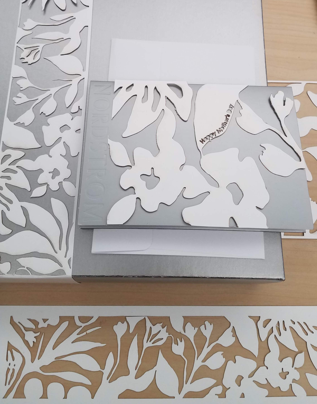
It was important to create a floral cutout pattern early in the design process. This pattern would lead and marry the different products together for this campaign. The cutout element harkens back to a more analog nature and relays a hand touched quality to customers.
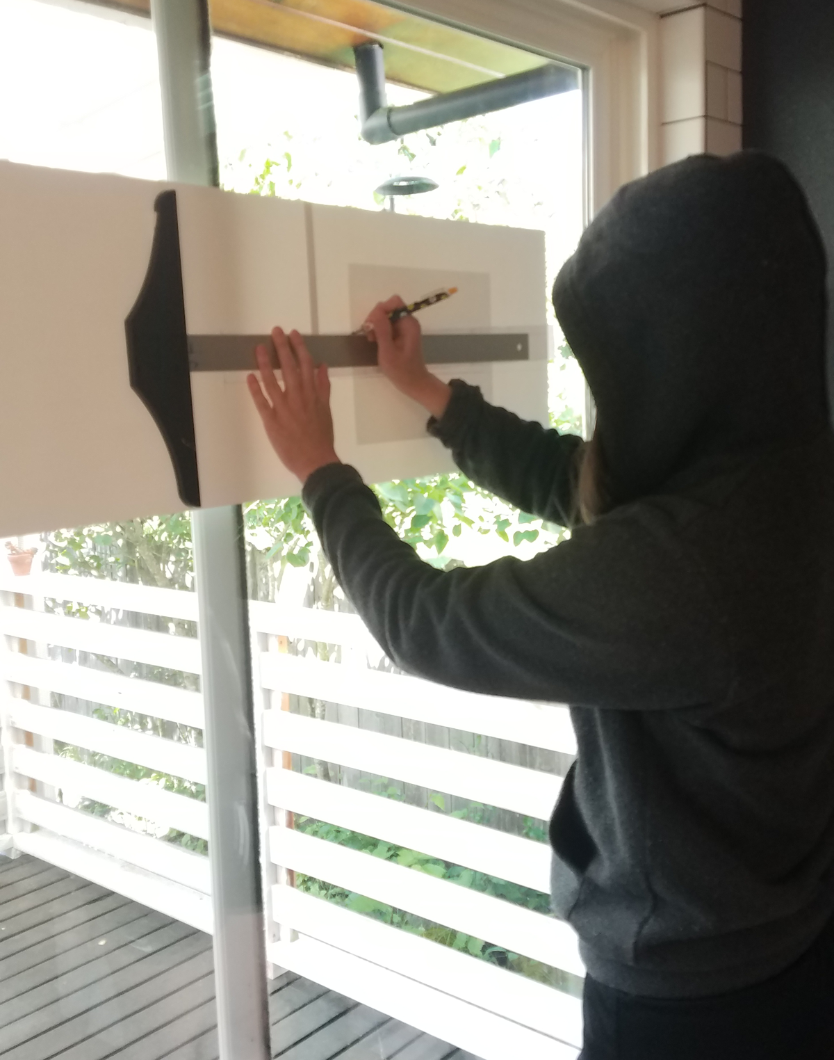
Early iterations of the belly band proved to be structurally weak and not feasible. Revisions were made to widen the edges of the band in order to reinforce it.
Early iterations of the belly band proved to be structurally weak and not feasible. Revisions were made to widen the edges of the band in order to reinforce it.

PACKAGING


PROJECT TAKEAWAYS
This packaging project was an opportunity to further explore packaging as well as utilize new tools. I had been intimidated by the laser cutter machine that lived at my school but decided that this was a great time to get over that feeling. Learning how to use this machine proved to be a fun experience as was designing the packaging to be structurally sound.
A graphic designer from Nordstrom was brought in at the end of the 5 weeks on this project. She came to listen to our proposals and examine our designed products. She stated that she could see my campaign existing within Nordstrom’s brand guidelines and that signified it as a success in my book.
A graphic designer from Nordstrom was brought in at the end of the 5 weeks on this project. She came to listen to our proposals and examine our designed products. She stated that she could see my campaign existing within Nordstrom’s brand guidelines and that signified it as a success in my book.
